

Each week we will post a new Top Ten list complete with one of our bloggers’ answers. Everyone is welcome to join. All we ask is that you link back to The Broke and the Bookish on your own Top Ten Tuesday post AND post a comment on our post with a link to your Top Ten Tuesday post to share with us and all those who are participating. If you don't have a blog, just post your answers as a comment
Top Ten Book Covers I Wish I Could Redesign (you know..those AMAZING books with horrid covers or those books with a so-so cover that you have an interesting concept for)
Once Upon a Twilight's List (in no particular order):
- Seers of Light by Jennifer DeLucy: I feel that the cover doesn't do the book justice, its a lot of black.

- Insight by Jamie Magee: Its not a attractive cover, won't pull me in to buy it. Yet its a awesome book.

- Reining In by Dawn Judd: this cover feels like something a younger person put together, it doesnt showcase the great story inside it.

- Vampire Diaries: Stefan's Diaries by L.J. Smith: I think they should get more creative then using the actors from TV faces to sell the book. Don't you think?

- Twenty-Five Years Ago Today by Stacy Juba: The cover kinda creeps me out in a bad way. Yet the story got 4 trees from us.

- My Invented Life by Lauren Bjorkman: This cover bothers me that it just consist of the 2 faces squish together, doesnt represent the Great story it is.

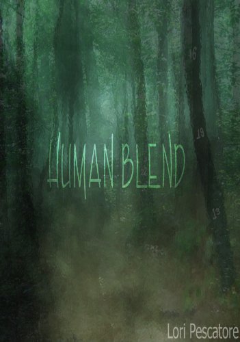
- Human Blend by Lori Pescatore: This was anothe rcove rthat just lacked in the art department and didn't support the great story inside.
- The Sapphire Talisman by Brenda Pandos: The only reason Im posting this cover here is because I truly loved the cover that won when they held a redesign contest. The cover blew me away.

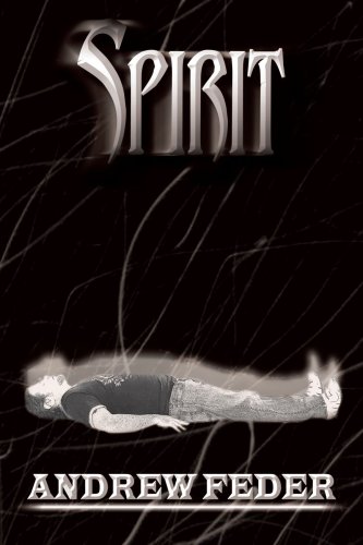
- Spirit by Andrew Feder: Great Story but this cover would never had inspired me to purchase the book.
- Twilight by Stephenie Meyer (1st Edition UK version): I'm so stinkin glad they got rid of this cover and switched it over to the US version. This cover is very creepy and doesn't at all represent anything about what Twilight is.

So there you have them, So what do you think of the choices. Now mind you this, all these books are either rated 5 tree or 4 tree on the blog, so the stories are great.


If I had, by any chance, picked the UK edition of Twilight I would never have read the book.
ReplyDeleteMy Top 10
I hated Twilight! I wish I had seen that cover first, so I wouldn't have picked it up LOL
ReplyDeleteI forgot about this cover, the original Twilight LOL. Im so sure if they had used this , they wouldnt have sold as many LOL.
ReplyDeleteOld Follower
www.thephantomparagrapher.blogspot.com
Dude there are some pretty fugly covers there,
ReplyDeleteI agree about Twilight and The Vampire Diaries, could be so much better
The Book Mystress, xx
l agree with all of these.
ReplyDeleteEspecially the Vampire Diaries, hate it when actors are on books.
Also dislike Insight by Jamie Magee but it is such a great book.
Ewwww What were they THINKING with Twilight??? WOW, Thanks for sharing, that just gave me the creeps!
ReplyDeleteI love the cover for "Seers of Light." It totally represents the story because that's the place where the two main characters go to get away from everyone and everything and its supposed to be dark and mysterious...
ReplyDeleteI'm REALLY glad they changed the cover for "Twilight." I had never seen that version before - and to be honest, it creeps me out! :)
Wow. I'd never seen the U.K. Twilight cover until now. I'm glad they changed it too.
ReplyDeleteI also hate when they use the actors for the TV shows or movies for the cover.
I feel ya on HumanBlend. It's like, "what?" Great list!
ReplyDeleteUgh that UK cover of Twilight is just horrible.
ReplyDeleteThose are some creepy looking covers. I would love to see them redesigned. Good picks.
ReplyDeleteYou guy want to know something about the ugly Twilight cover, well now its a collectible and it sells for a lot of money. So if you find a copy Grab it and sell it.
ReplyDeleteOooooh, I never would buy Reigning In with that cover. Yikes!
ReplyDeleteNice choices, I agree.
ReplyDeleteStop and see mine and my giveaways.
Great choices. I agree with your picks. I forgot about the UK version of Twilight. It is really creepy.
ReplyDeleteYou have a good point with Reining in. Does not attract at all.
ReplyDeleteI totally agree on your choices. I bet Twilight wouldn't have been such a success if they'd stuck with that cover, lol.
ReplyDelete1) Insight -- MERCY. I don't even know where to start. I feel like I'm in the Twilight Zone just trying to figure it out.
ReplyDelete2) My Invented Life -- This is what happens when you stare at Facebook profile pics all day long to come up with inspiration.
3) Twilight UK first edition -- I just. What. WHAT.