
The Vyne: Mystery of the Hidden Ember Cover Interview
Today we are excited to present to you all a great interview about the cover of The Vyne written by Daniel Walls. Make sure to come back on February 17th when we will post the review for The Vyne. This tour is hosted by the lovely ladies at Teen Book Scene CLICK HERE for complete list of schedule.
Welcome Daniel!
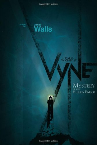
Yara: What inspired the Lighthouse? Is this a Lighthouse we can actual find somewhere in the world?
Daniel: They are so lonely, always in such desolate outposts. It was the perfect haunting setting for the story’s climax. I hope to God it’s not a lighthouse we can actually find. If you do find it, don’t tell me about it.
Yara: You went with very dark colors suck as Blues and Blacks, what were you trying to get across with these choices?
Daniel: I liked the idea of conveying the story’s fear and mystery in the book’s cover. Darkness is always associated with fear (thus the black). The blue tones represent the chilling atmosphere that carries the plot as well as the overall nautical themes found throughout the story.
Yara: The lighthouse light being on is a beacon for what in your mind?
Daniel: The whole idea behind the function of a lighthouse is to warn of against oncoming danger by means of its lantern. In The Vyne, the lighthouse lantern has been replaced by something else, something dark and elusive (the antithesis of a lantern). I show a subtle glow emitting on the book’s cover (representative of the electrical surges pulsating throughout the lantern room’s mysterious expanse). It is a bit of a warning against the looming dangers in the story and oncoming, more lethal dangers that will be introduced in book two.
Yara: When choosing the graphics for the title, were there any particulars you were looking for?
Daniel: Yes. I’m a big fan of vintage move posters (classic Frankenstein, King Kong, Caslablanca…). But I wanted something fresh and more modern. I’m also a big fan of contemporary classic hardbound book covers from the 50’s and 60’s. There’s just such a great simplicity in how they were designed, yet they weren’t boring.
I originally wanted to design a cover that was more in the vein of a Chip Kidd cover. But I realized that I couldn't just design a cover for me. It had to resonate with my audience, an audience who reacts to Harry Potter, Percy Jackson, Narnia and so on. So I decided to create a bit of a high bred.
Striving for simplification, I asked myself what one icon I felt spoke best for the entire story. Initially it was a sword. But that seemed far too expected. Then it was a spooky tree line. I loved it, but felt it didn’t strike the eye enough. I tried silhouettes of characters and that didn’t seem right either. But when I finally tried the lighthouse, something clicked. By all means, it does represent the height (no pun intended) of fear and evil in the book. It just worked.
Yara: How long did the whole process take you from start to finish to complete the cover?
Daniel: On and off for a year. I wasn’t even done writing when I began designing the cover. (I guess that’s just the designer in me.) I had been pulling a lot of images for visual reference for places in the book. And as I would collect, I couldn’t help but imagine how they would kind of blend together to form the tone of the cover. The words (“The Vyne”) took the longest, as it was all drawn by hand.
Yara: Anything else that you would like to share?
Daniel: Never in my life have I invested so much of my own creative energy into one single project. From the writing, to the designing, to the process of getting published, it’s been nothing shy of exhausting. But it has been more than worth it. I’m no star. These are very humble beginnings. But just being able to put a fun tale in front of people and let them visit the world I’ve created for a while, means more to me than anything. Being able to converse with you about it and to share creative thoughts, that’s what makes it worth all of the work. “Thank you.”

About the Author:
Daniel Walls is an award-winning art director/designer.
An Art and Design graduate from Saint Paul College (1996), Daniel holds two Creative Writing degrees from Long Ridge Writers Group (1997 & 2008). In 2006 LRWG named him one of their most promising writers, asking him to pilot a new course in Novel Writing. Upon Daniel's completion of this course, his professor (novelist, Tom Hyman) writes: ''Dan shows considerable talent as a writer and has already developed a distinct and strong prose style, consistently demonstrating a mastery of structure, character creation, narrative and dialogue. He shows the ability to create at a level that has both an intellectual and an emotional impact on the reader. Dan shows great imagination in his work.''
As a boy growing up on the Canadian border of northern Minnesota, he spent most of his free time writing and illustrating fantasy stories, sharing them with his devoted audience, an English Springer Spaniel. The Vyne is his first full-length novel, and he promises it will not be his last. Daniel lives with his wife, two children, three-legged dog, and sometimes-present cat in Minneapolis. Currently he is penning the second thrilling installment of The Vyne saga.
Website: http://www.vynesaga.com/
Thank you again to Daniel Walls and Teen Book Scene for the opportunity.


That is one of the most interesting book covers I've seen in a long time.
ReplyDelete