Showing posts with label cover interview. Show all posts

Blog Tour: Underwater by Marisa Reichardt | Guest Post | Giveaway


Welcome to our stop on Underwater tour for Marisa Reichardt. This tour is hosted by The Fantastic Flying Book Club Tours.

Underwater
Author: Marisa Reichardt
Reading Level: Young Adult
Genre: Contemporary
Released: January 12th 2016
Publisher: Farrar, Straus, & Giroux

 
Morgan didn’t mean to do anything wrong that day. Actually, she meant to do something right. But her kind act inadvertently played a role in a deadly tragedy. In order to move on, Morgan must learn to forgive—first someone who did something that might be unforgivable, and then, herself.

But Morgan can’t move on. She can’t even move beyond the front door of the apartment she shares with her mother and little brother. Morgan feels like she’s underwater, unable to surface. Unable to see her friends. Unable to go to school.

When it seems Morgan can’t hold her breath any longer, a new boy moves in next door. Evan reminds her of the salty ocean air and the rush she used to get from swimming. He might be just what she needs to help her reconnect with the world outside.

Underwater is a powerful, hopeful debut novel about redemption, recovery, and finding the strength it takes to face your past and move on.
STORY BEHIND THE COVER


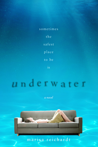
I was so honored to have the opportunity to speak with my cover designer, Andrew Arnold about the phenomenal cover design he did for Underwater. Here’s our chat.


1. One of the most exciting parts of the debut experience was that first moment when I opened my email to see your AMAZING cover design for UNDERWATER. I literally gasped. I loved it so much. How do you begin the brainstorming process for a cover design and, more specifically, what were some of the things you took into consideration for UNDERWATER?

I'm so glad you're happy with it—and I'm so glad that I was able to design it!

With every cover I design, one of my main goals is to capture the tone of the story. Sometimes a scene can help me do that, or sometimes it's an icon. Or, maybe it's an image—or several images—that come to mind as I'm reading the book. As I read UNDERWATER, a few things kept coming to mind: Morgan's apartment, couch, and high school swimming pool. I wasn't entirely sure how—or even if—these images could work together, but they interested me the most so I started laying out a few of my ideas.

2. Conceptually, I'm in love with the couch underwater. From the moment I saw it I knew it was perfection. How did you think to merge the isolation of Morgan on her couch with the pool?

I had several versions of this cover where Morgan was laying on the couch against a blue wall. I really liked those earlier versions and thought one could work, but the more I looked at them the more I thought the wall wasn't enough. They felt like they were missing something. I quickly swapped it out with water (fully convinced that it would look silly, by the way...) but was surprised by how much I liked it once it was there. After some tweaking and patience, it finally felt right to me.

3. The scale of Morgan is so small compared to the shock of blue water. Was that scale intentional? To show pressure on Morgan?

Yes, that scale was most definitely intentional! I hadn't intended for it to show pressure but loneliness. When the cover had a big blue wall, I thought it did a really good job of capturing that. Once I swapped the wall with water, that sense of scale took on a new meaning. It's interesting how things can just sort of happen when you continue to explore, you know...?

4. I know you have a background in comics and cartooning. How did we get so lucky to find you in the world of YA book cover design? 

The beauty of having a background in comics and cartooning is that it can lead you into so many different places: comics, picture books, film, animation, design... Similar to cartoonists, cover designers use both words and pictures together to relay information to readers. I know the link between these two professions may sound like a stretch, but for me it's what I find most enjoyable about what I do!

5.  Do you have any exciting upcoming projects you can tell us about?
My fellow co-authors James Sturm, Alexis Frederick-Frost and I putting the finishing touches on HOCUS FOCUS, the last picture book in the Adventures in Cartooning series. Aside from that, I'm in the beginning stages of putting together some other picture book ideas that I hope to have ready in the near future... Hopefully more on those soon!

Thanks so much, Andrew! This is great insight to the world of book cover design!


I'm a SoCal native and high school writing instructor. I currently live in Los Angeles and can usually be found huddled over my laptop in coffeehouses or swimming in the ocean.

My debut YA contemporary novel, UNDERWATER, will be out 1/12/16 from Macmillan/FSG and 4/7/16 Macmillan Children's UK.

I love all books and all genres. While I do keep track of all the books I've read here, I generally don't do ratings or reviews.


- Open to US ONLY.
- Must be 13 or older to enter.
- Giveaway starts 1/7 until 1/23.
- All entries are double-checked and false entries will be disqualified
- Winner will be notified via email and needs to answer in 48 hours letting us know if he/she accepts the prize and send us his/her full name and address.
- Your personal information won't be used or be seen unless you're the winner of the giveaway. We won't sell it nor use it in a bad way. But please note that your full name and address will be sent to Fierce Reads in order for you to get your prize.
- Tour Hosts as well as the member of the FFBC Tours are not responsible for any lost or stolen items.
- One participant cannot win more than one prize in a same giveaway. See our Tour Guidelines in our website for more information.


a Rafflecopter giveaway


Cover Interview: Author Emma Michaels on Designing Book Covers


Emma Michaels Links: Blog / Goodreads / Amazon / Twitter

OUaT: Welcome Emma to the site. Thank you for taking time out of your busy schedule to answer some questions. Tell us first what is the most difficult process of designing a book cover?

Emma: Thank you for having me! I think the most difficult part of the process really depends on the person. For me it is finding that original stroke of inspiration. Once I get it, the rest comes naturally but I really have to let a novel be all consuming when I read it to get a lot of the ideas I end up using. I normally end up with too many ideas and then have to weed through them for the right one(s).

OUaT: How much say or opinion do you get from the authors?

Emma: Part of what I love about working with publishers that are more personal is that authors get a lot more input. The other day I was asked why I decided to start doing cover art and I hadn’t really thought about it until then. I answered honestly but my answer surprised me. “I decided to do cover art because I wanted to be able to give authors that dream cover they never thought they would get to have.” So many authors at conventions, signings or larger events like BEA and ALA had told me in normal conversation how disappointed they had been or the dream cover that had always imagined and one day I sat down and tried to make my own dream cover. I managed to do exactly what was in my mind and it made me wonder if I could do that for others. Once I realized I might be able to help authors and reader be more passionate about wonderful books I decided to keep going with it!

OUaT: What programs or web site do you use to make the book covers?

Emma: This is a question that I have even had other artists ask me but the full answer is a bit complicated because I use so many websites and programs. I am always trying new things. Alot of the projects have different needs. I use GIMP and now that I just got a tablet I have been using ProCreate too. But when it comes to resources, I have too many sources to list. I am constantly on the lookout for new tools and amazing stock and if I can’t find what I need then I find a way to create it.

OUaT: Have you come across any covers that look similar or the same to ones you have designed?

Emma: To be perfectly honest, I don’t really think about it. I come across covers that have color tones I love and want to try out or covers that inspire to want to be an even better artist but I have a tendency to let a cover slip from my memory after I create it so that I never reuse the idea accidentally or feel like I only have certain things I can accomplish. I find that if I look at a cover as a world of possibilities I am more likely to create something edgier and unlike my previous works.

OUaT: What do you enjoy the most about designing the covers for the authors?

Emma: Feedback and exploration. I love trying new things and getting to hear that an author has a cover they can be proud of. I know not all of my covers will be perfect but when I hear that it is a cover the author loves it is always something that lifts my spirits and makes me want to do even more.

OUaT: Can you share with us today 3 of your most favorite covers that you have designed?

Emma: This is a hard one because I have just started training myself in a few new programs with my tablet and now have a LOT of sample covers I am currently working on and loving. From the currently published novels I would have to say that Until Next Time by Amy Lignor is my number one favorite, then Night Sky by Jolene Perry which was a project I did in collaboration with another artist is another one and then one of the latest Tribute novels The Color of Snow was one that was conceptually a lot of fun to work with.

OUaT: What advice can you give other designers or even authors about book covers?

Emma: For authors who are asked for concepts that would like or ideas they have imagined I would say, feel free to dream big. I know most authors don’t get to but you deserve to have a cover you can honestly believe in and that makes you proud to show off your novel to anyone and everyone. To designers, I know it is hard to take so much time on a piece that has a fate completely separate from you but never be afraid to always put your best work into it, after all, if you don’t put your heart into it then you are the one stunting your own growth.

OUaT: What are your favorite types of covers you like to designed?

Emma: All of them. I love when an author has ideas, a lot of time it can give me insight into how they imagine their cover so that I can either give them what they want or even expand upon the idea but with genres I am open to anything, though admittedly, like with my writing, I have a soft spot for YA novels.

OUaT: If you were a book cover, how would you look?

Emma: Edgy, multi-faceted and too complex to be a good cover. I made a better artist and author, I think they are the two professions I enjoy where being both overly organized and too imaginative for my own good come in handy. I guess if I actually imagine the cover though, I can’t help but think of different things I enjoy like the wind in my hair, colder temperatures and there would probably be pieces of paper flying in the wind to symbolize the way I am always surrounded by ideas so who knows. Maybe one day I will experiment and find out. :p

Thank you so much for having me here! I had a blast answering your questions and hope everyone loves the amazing novels Tribute Books has been releasing, I know I have been!

The Writers Voice: http://OurBooksOurVoice.Blogspot.com
Personal Blog: http://EmmaMichaels.Blogspot.com
Cover art portfolio: http://media.bokheim.com/Folio.html
Website: http://www.emmamichaels.com/
Facebook: https://www.facebook.com/pages/Emma-Michaels/155779087828709
Twitter: https://twitter.com/emmamichaels

Here are examples of Emma's work:


Book Tour: The Vyne Cover Interview


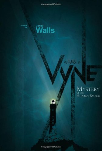
The Vyne: Mystery of the Hidden Ember Cover Interview

Today we are excited to present to you all a great interview about the cover of The Vyne written by Daniel Walls. Make sure to come back on February 17th when we will post the review for The Vyne. This tour is hosted by the lovely ladies at Teen Book Scene CLICK HERE for complete list of schedule. 

Welcome Daniel!
Yara: What inspired the Lighthouse? Is this a Lighthouse we can actual find somewhere in the world?
Daniel: They are so lonely, always in such desolate outposts. It was the perfect haunting setting for the story’s climax. I hope to God it’s not a lighthouse we can actually find. If you do find it, don’t tell me about it.

Yara: You went with very dark colors suck as Blues and Blacks, what were you trying to get across with these choices?
Daniel: I liked the idea of conveying the story’s fear and mystery in the book’s cover. Darkness is always associated with fear (thus the black). The blue tones represent the chilling atmosphere that carries the plot as well as the overall nautical themes found throughout the story.

Yara: The lighthouse light being on is a beacon for what in your mind?
Daniel: The whole idea behind the function of a lighthouse is to warn of against oncoming danger by means of its lantern. In The Vyne, the lighthouse lantern has been replaced by something else, something dark and elusive (the antithesis of a lantern). I show a subtle glow emitting on the book’s cover (representative of the electrical surges pulsating throughout the lantern room’s mysterious expanse). It is a bit of a warning against the looming dangers in the story and oncoming, more lethal dangers that will be introduced in book two.

Yara:  When choosing the graphics for the title, were there any particulars you were looking for?
Daniel: Yes. I’m a big fan of vintage move posters (classic Frankenstein, King Kong, Caslablanca…). But I wanted something fresh and more modern. I’m also a big fan of contemporary classic hardbound book covers from the 50’s and 60’s. There’s just such a great simplicity in how they were designed, yet they weren’t boring.
I originally wanted to design a cover that was more in the vein of a Chip Kidd cover. But I realized that I couldn't just design a cover for me. It had to resonate with my audience, an audience who reacts to Harry Potter, Percy Jackson, Narnia and so on. So I decided to create a bit of a high bred.
Striving for simplification, I asked myself what one icon I felt spoke best for the entire story. Initially it was a sword. But that seemed far too expected. Then it was a spooky tree line. I loved it, but felt it didn’t strike the eye enough. I tried silhouettes of characters and that didn’t seem right either. But when I finally tried the lighthouse, something clicked. By all means, it does represent the height (no pun intended) of fear and evil in the book. It just worked.

Yara: How long did the whole process take you from start to finish to complete the cover?
Daniel: On and off for a year. I wasn’t even done writing when I began designing the cover. (I guess that’s just the designer in me.) I had been pulling a lot of images for visual reference for places in the book. And as I would collect, I couldn’t help but imagine how they would kind of blend together to form the tone of the cover. The words (“The Vyne”) took the longest, as it was all drawn by hand.

Yara: Anything else that you would like to share?
Daniel: Never in my life have I invested so much of my own creative energy into one single project. From the writing, to the designing, to the process of getting published, it’s been nothing shy of exhausting. But it has been more than worth it. I’m no star. These are very humble beginnings. But just being able to put a fun tale in front of people and let them visit the world I’ve created for a while, means more to me than anything. Being able to converse with you about it and to share creative thoughts, that’s what makes it worth all of the work. “Thank you.”


About the Author:


Daniel Walls is an award-winning art director/designer.
An Art and Design graduate from Saint Paul College (1996), Daniel holds two Creative Writing degrees from Long Ridge Writers Group (1997 & 2008). In 2006 LRWG named him one of their most promising writers, asking him to pilot a new course in Novel Writing. Upon Daniel's completion of this course, his professor (novelist, Tom Hyman) writes: ''Dan shows considerable talent as a writer and has already developed a distinct and strong prose style, consistently demonstrating a mastery of structure, character creation, narrative and dialogue. He shows the ability to create at a level that has both an intellectual and an emotional impact on the reader. Dan shows great imagination in his work.''
As a boy growing up on the Canadian border of northern Minnesota, he spent most of his free time writing and illustrating fantasy stories, sharing them with his devoted audience, an English Springer Spaniel. The Vyne is his first full-length novel, and he promises it will not be his last. Daniel lives with his wife, two children, three-legged dog, and sometimes-present cat in Minneapolis. Currently he is penning the second thrilling installment of The Vyne saga.


Thank you again to Daniel Walls and Teen Book Scene for the opportunity. 


Related Posts Plugin for WordPress, Blogger...